Palettes and Place
I drove over to Camden, Maine last week to pick up an order of canvasses, and it was lovely to see the ocean again.
I always look forward to my first glimpse of an inlet, with its silvery light of sky and burnished grey of water, as I come back to the Maine coast each spring.
“July Morning, Maine”, 20” x 20”, oil on linen
Looking out from the car window along Route 1 got me thinking about how specific a landscape painter's palette is to locale. The two New England states where I have painted the most--Vermont and Maine---each call up very different colors in my mind's eye.
( New England's landscape color is completely changed by season, so I'll just look at summer color here.)
Oil swatches mixed with Cadmium Yellow, Perm. Alizarin Crimson, Prussian Blue, and Cerulean Blue.
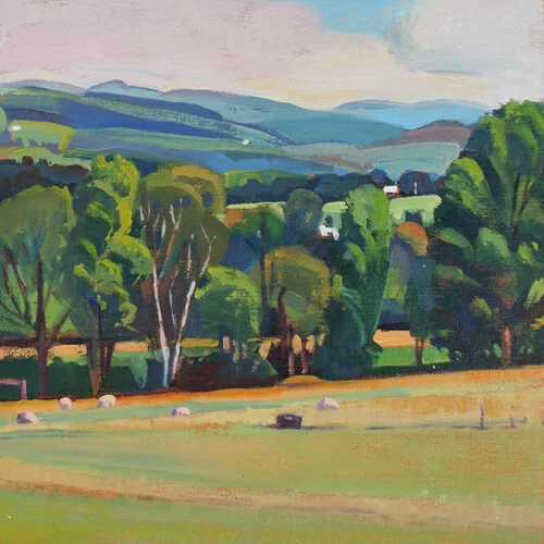
Greens in Vermont in the early summer are clean and intense, with a wide range of warm and cool that I can vary with mixes of Cadmium Yellow and Prussian Blue.
I find that shadows set amid these strong yellow greens will push into cool reds and red purples, creating a complementary contrast.
"Sheep and Trough, August Morning", 10" x 10", oil on linen panel
Farm equipment, barns, and dirt roads provide warm red accents. An occasional local color like a red tractor can extend a painting's palette with an unexpected accent.
“Silo and Shed”, 16” x 16”, oil on linen panel
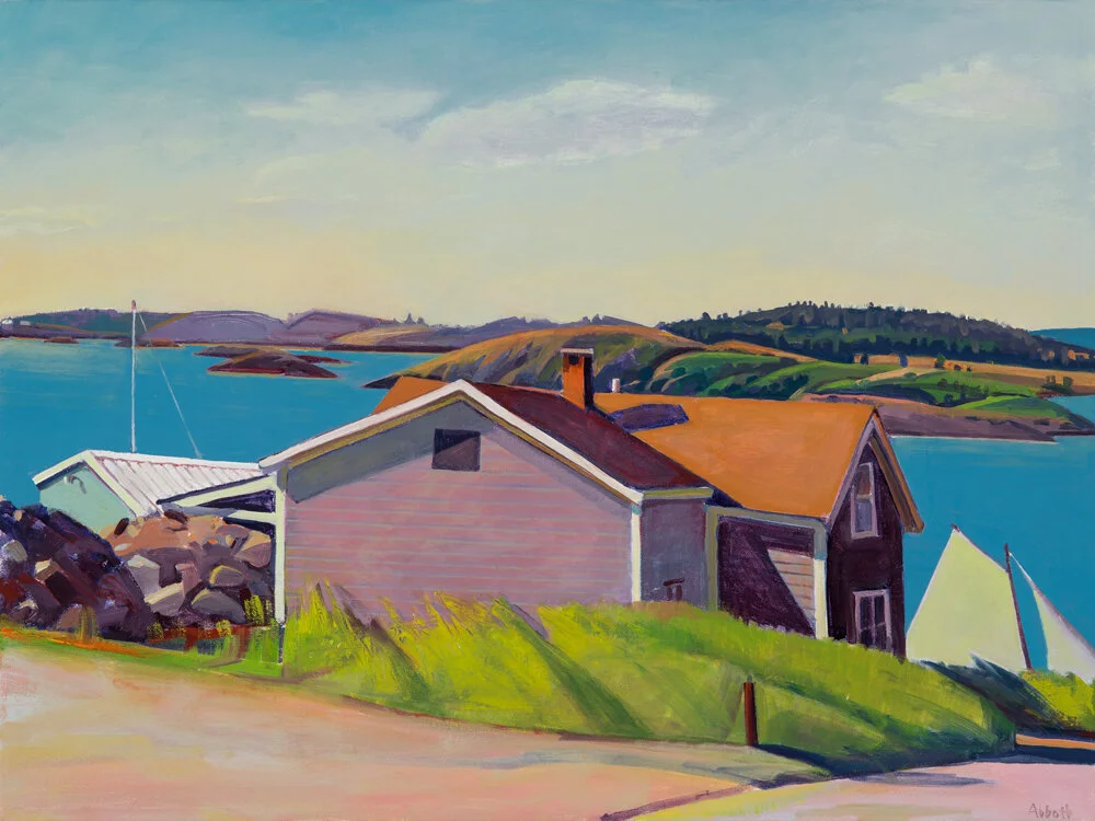
In Maine I see color that is much less intense than in Vermont, much more subtle and muted because of the diffused light from all that water.
A Maine seascape painted with Yellow Ochre, Cobalt Blue, and Permanent Rose watercolors
I find the Maine coastal landscape full of beautiful chromatic greys, warm or cool neutrals that are pushed just slightly into color.
My palette for painting the Maine coast often begins with different blues than I tend to use in Vermont.
Ultramarine or Cobalt Blue will mix with a cool red like Alizarin Crimson into a clean violet, a good base for a subtle yet colorful grey .
“The Captain’s House”, 22” x 28”, oil on linen
The third leg of this more toned-down Maine triad may be Ochre or Naples Yellow, rather than a brighter Cadmium Yellow (though that cleaner yellow is still useful for painting grass in sunight.)
Swatches of Permanent Rose, Yellow Ochre, and Cerulean Blue oils from a Maine landscape study
Susan Abbott, "Farther East", 48" x 48", oil on linen
If a Maine motif calls for a different palette of chromatic greys, Cerulean Blue substituted for Cobalt Blue will mix into more subdued violets but brighter greens.
“Sailing Home, Lubec”, 18” x 24”, oil on linen
The possibilities are endless. Starting with a triad of primaries based on one's own perception of the motif's dominant hues can keep a painter from feeling overwhelmed by the infinite color choices in any landscape.
Susan Abbott, "Sunday Morning Coffee", 24" x 24", oil on linen panel
I'm a big fan of Edward Hopper's watercolors, and especially love his series from Maine for their original design, subtle palette, and powerful use of darks.
Edward Hopper, "Light House and Building, Portland", watercolor
I'm looking forward to visiting this summer's Middlebury College exhibit of Hopper's rarely seen Vermont watercolors. Hopper "periodically sought inspiration in Vermont when he found himself unable to discover it elsewhere", according to the show's catalog.
I'll be very interested to see if Hopper's change of locales, from the foggy New England ocean to Vermont's inland sea of summer greens, inspired any shift in his own color palette.
Edward Hopper, "First Branch of the White River, Vermont", watercolor
Your comments are welcome below! Feel free to leave your name and website address.


