White on White
My paintings have neither object nor space nor line nor anything – no forms. They are light, lightness, about merging, about formlessness, breaking down form. A world without objects, without interruption. Agnes Martin
Agnes Martin, “The Tree”, oil on linen
Vermont is a very white place right now. More accurately said, the landscape here is a canvas covered in white snow that picks up, reflects, and bounces back the light and color of the sky. This makes for a subtle and constantly shifting palette of warms and cools, and tinted colors, and white on whites.
Susan Abbott. “Snowplow and Red Shed”, oil on linen
The painter Robert Ryman died recently, and that’s another reason I’ve been thinking about white on white. Ryman’s work explored the absence of color in just about every medium you can imagine, including oil, acrylic, casein, gouache, gesso, enamel, pastel, and polymer.
He painted on linen, wood, aluminum, vinyl, steel, wax paper, cardboard, gauze, and coffee-filter paper. All this invention was at the service of getting the most he could out of the least color.
Robert Ryman, “Surface Veil”, oil on fiberglass with waxed paper frame and masking tape
Ryman was self-taught, and began painting while employed as a museum guard. At first he used the bright colors he saw in abstract painting, but he wasn’t happy with the results, so he painted over the greens and reds on his canvasses with gesso.
He said his thinking was, “I’m only using color because somehow being a painter I should. But here I am painting it out, so why not get this idea down a little stronger, and not put the color on in the first place?” Ryman became passionate about the potential and possibilities of white.
Robert Ryman, “Untitled”, oil on linen
“No color” is harder than it sounds. Our tendency (or mine anyway) is to define shapes, rather than welcome ambiguity. Since white is the opposite of dark, there’s a very small range of contrast available in a composition that’s being played mostly on this extreme upper register of the value scale.
That means that differences in shape need to come from subtle shifts in warm and cool, or small variations in tone. This utilizing of both restraint and decisiveness is easier said than done.
John Henry Twachtman, “Snow”, oil on canvas
Even a small area of dark creates enough contrast to make a more obvious design, and changes the meditative mood of an entirely light composition. (Not to a bad mood, just a different one.)
Justin Mortimer, “Snow Bank”, oil on canvas
Giorgio Morandi was another painter passionate about white on white. He collected white objects for his still life, and arranged them against light backgrounds to explore all the varied ways that shapes react to each other, to light, and to the air around them.
Sometimes his lightest values push into definite colors, but a harmony of chalk and ivory and cream always underlies these compositions.
Giorgio Morandi, “Still Life”, oil on canvas
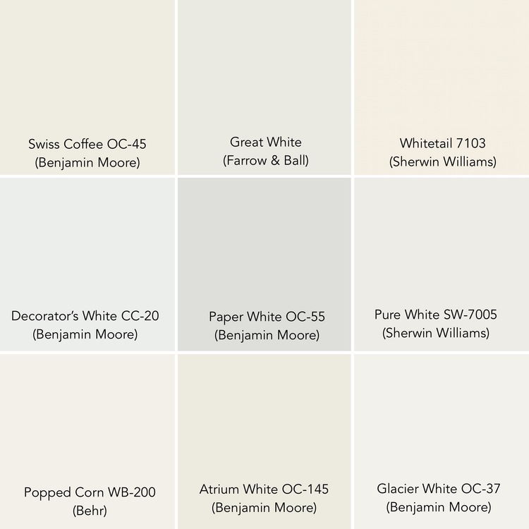
You’ll notice my definition of white is elastic enough to include at least some hue and some tone. If you’ve ever shopped for white house paint, and been overwhelmed by choices, you’ll appreciate my point that “white” can stretch far in many different directions.
Skilled painters expand the meaning of white by adding tints from all around the color wheel. Our eyes and brains, always looking for pattern, and for differences in shape, can find a color composition no matter how subdued.
Peter Doig, “Buffalo Station”, oil on canvas
I think what I like best about the absence of color is the quiet. White whispers us closer in, and invites us to rest awhile, and look.
Edmund de Waal, “White”, porcelain and wood
A white surface emphasizes the “thingness” of a thing. Without color, we’re only left with shape. A pure white painting makes us more aware that it’s an object made of wood and pigment and canvas.
Robert Rauschenberg, “White Painting”, oil on canvas (three panels)
That tension between the “thingness” of a painting, and the illusion the paint makes on its surface, is pretty exciting stuff—especially if you’re able to experience it face to face.
If you have the chance in The Museum of Modern Art, try spending some time in front of this Malevich “White on White”. There’s more here than meets the eye, if our eye slows down a little.
Kazimir Malevich, “White on White”, oil on wood
Tomorrow, I’ll be back looking at that cold white stuff that’s banked against my house, and piled along the roads, and covering every square inch of green in this Green Mountain State.
Andrew Wyeth, “The First Snow”, watercolor
I’ll paint the winter landscape once again, and probably, once again, not be quite satisfied that I’ve matched exactly what I’m seeing in my mind’s eye.
But what a wonderful problem to have, this trying to get white on white (on white) exactly right.
Susan Abbott, “White Buildings in Winter”, mixed media
Your comments are welcome below!


